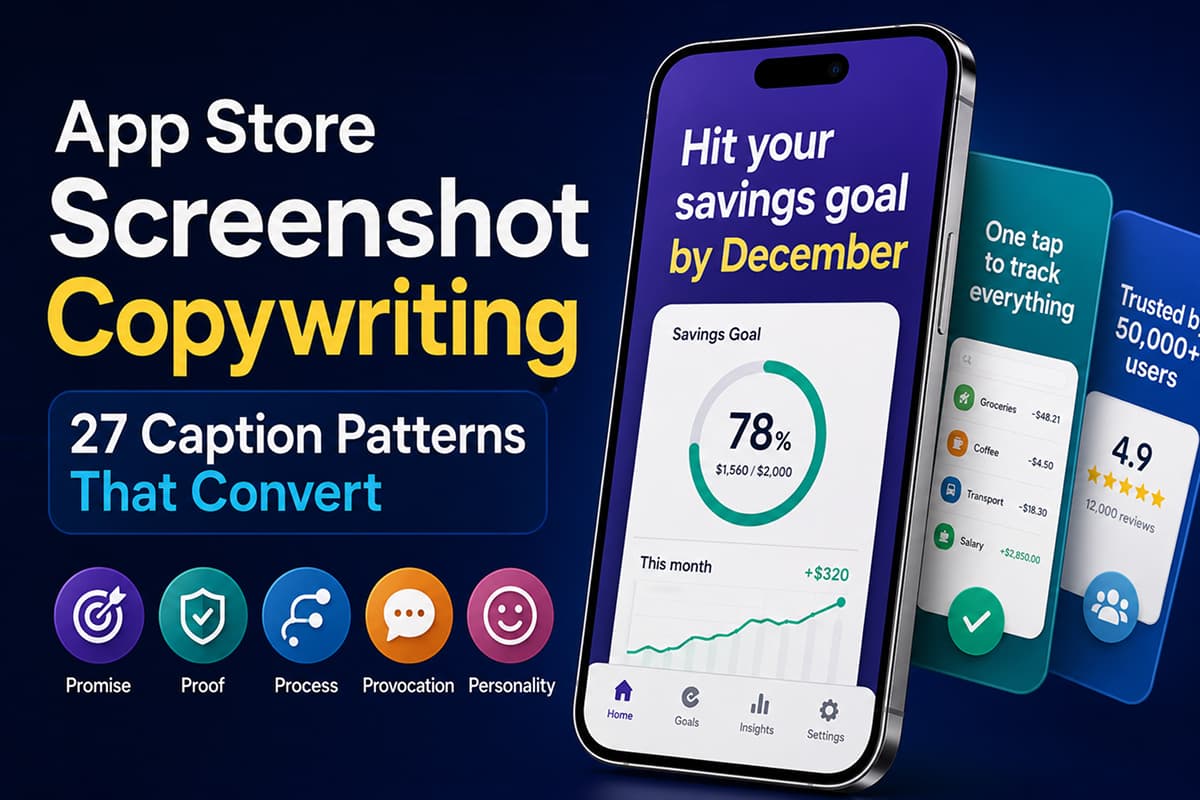
App Store Screenshot Copywriting: 27 Caption Patterns That Convert
The full playbook for writing app store screenshot captions that actually drive installs. 27 patterns grouped into 5 categories, the rules Apple enforces, and the localization gotchas that quietly kill conversion.
A swipe file of 27 caption patterns we keep coming back to when a screenshot strip isn't converting, plus the rules Apple and Google quietly enforce on the text you put on top of it.
We spend an embarrassing amount of time looking at other people's app store listings. Most of them have one thing in common: the design is fine, sometimes great, and the copy on the first screenshot is doing none of the work it's supposed to be doing. It's a feature name, or a tagline copy-pasted from the marketing site, or a sentence that could sit on top of any productivity app ever shipped.
That first caption is roughly the most important sentence your app will ever write. The median App Store visitor spends about seven seconds on a product page and looks at two or three screenshots before they decide. Most never scroll down to the description. The text on the first screenshot is what gets read.
This piece is what we send to founders when they ask us to look at their listing. It's structured the way we actually think about caption work: the three jobs the caption has to do, the 27 patterns we pull from when we're stuck, then the small print — Apple's rules, the localization stuff that breaks German, and what to actually test.
What the caption is for
Three things have to happen in the first second of a user looking at your screenshot, and the design only handles one of them.
The visual shows that your app is real. It's a screen, on a phone, doing a thing. That's genuine proof, and it's usually the easiest of the three. What the visual can't do is tell the user what category your app is in (it could be anything that looks like that), or what they personally get out of it. Those two jobs belong to the caption, and a caption that only does one of them, or that confuses the two, is most of why listings under-convert.
The trap is that captions that try too hard at "what do I get" — Promise captions, in our terms below — sometimes forget to position the app at all. "Finally, peace of mind" could be a meditation app, an insurance app, a budgeting app, or a security camera. The caption has to do both jobs at once, in seven words or fewer. That's the constraint.
The rules before you write anything
None of what's below is theoretical. It's the floor — break these and the caption underperforms, the reviewer pushes back, or both.
- Two to seven words. The shorter end almost always wins. Eight words and up reads as a block of gray at thumbnail size and gets skipped.
- Lead with a verb or an outcome. "Track. Plan. Win." tells the user nothing. "Hit your savings goal by December" tells them what their December looks like.
- One idea per screenshot. If the caption needs an "and", it's two captions.
- Squint test. Hold your laptop at arm's length. If you can't read the caption from there, neither can someone scrolling at speed in line for coffee.
- No superlatives, no naming competitors. "#1", "best", "world's leading", "better than [App]" — Apple's review team treats these as unverifiable claims and bounces the submission. More on what specifically gets caught further down.
- Plain English. Cut "leverage", "solution", "empower", "unlock". If you wouldn't say it out loud to a friend, it doesn't belong on a screenshot.
- Each caption advances the pitch. Six screenshots, six distinct ideas. Two captions making the same point is one wasted slot.
If your current captions break more than one of these, the rewrite is more valuable than anything else you could do to the listing this quarter. The patterns below are what we rewrite into.
The 27 patterns
Captions roughly cluster into five families. They're not a science — there's overlap, and some captions sit on the line between two — but the grouping is useful because each family answers a slightly different user question, and you want a mix across the listing rather than five variants of the same beat.
For each pattern you'll see a brief note on what it's doing and two example captions. The examples are written for hypothetical apps — don't copy them, the point is the shape, not the words. Your app's voice is yours.
Promise — what the user gets
The Promise family is the workhorse. Almost every good screenshot 1 caption is one of these, for one reason: the user is asking "what does this app actually do for me" before anything else, and a Promise answers it directly. If you read nothing else in this post, get screenshot 1 to a Promise caption you believe in.
| Pattern | Example caption |
|---|---|
| 1. The outcome verb Lead with what the user does or gets | "Run your first 5K in 8 weeks" "Read 12 books a year, easy" |
| 2. The time-bound promise Adds urgency by anchoring to a calendar | "Inbox zero by lunch, every day" "Save $200 by your next paycheck" |
| 3. The identity shift Sells who the user becomes, not what they do | "Become the runner you've been promising" "Sleep like someone who has it together" |
| 4. Before / after Compresses a transformation into a sentence | "From idea to invoice in one tap" "From chaos to calendar in 5 minutes" |
| 5. The concrete number A specific outcome the user can picture | "Cut 4 hours of email a week" "Cancel 7 subscriptions you forgot about" |
| 6. Permission and relief Names the emotional weight you remove | "Finally, a budget you'll actually keep" "Stop dreading your inbox" |
A note on the Identity Shift pattern — it's the most powerful one in the Promise family when it lands, and the most embarrassing when it doesn't. "Become the runner you've been promising" works because there's a real internal monologue it's answering. "Become your best self" doesn't, because nobody talks like that. The test: would your target user privately admit to wanting the thing the caption names? If not, write a different one.
Proof — why the user should believe you
Proof captions only work if the visual underneath them is the actual UI doing the actual thing. Floating a number on top of a generic gradient feels exactly as hollow as you'd expect. Use these in positions 2, 3, or 6 — never on screenshot 1, because a Proof caption doesn't tell a new user what the app is.
| Pattern | Example caption |
|---|---|
| 7. Social-proof number Volume signals safety | "Trusted by 50,000 indie founders" "1.2M runs logged this year" |
| 8. Press quote Real publication, real quote, no superlatives | "'Surprisingly delightful' — The Verge" "'The first one we actually use' — Wired" |
| 9. Ratings strip Numbers do the work — but check Apple's rules | "4.9 stars · 12,000 reviews" "Rated 4.8 in 32 countries" |
| 10. The stat that does the work A measured outcome users actually achieve | "Users save 4.2 hours every week" "87% finish their first month" |
| 11. The outcome story One named person, one specific result | "Maya hit her savings goal in 28 days" "Sam reads 30 minutes a day now" |
| 12. Scale or volume A big number that signals real usage | "73 million scans completed" "Synced across 4 million devices" |
Proof numbers should be true, sourceable, and current — they'll end up on press pages and in support emails, and a number you can't back up becomes a liability the moment someone with a notebook asks where it came from. If you're early enough that you don't have a number worth bragging about, skip this family entirely. A bad Proof caption is worse than none.
Process — show that it's easy
Process captions sell ease. Reach for them when the genuine differentiator is "this is fewer steps than what you're currently doing". They land best in positions 2 to 4, and they pair well with a screenshot that visibly compresses something — a multi-step flow shown as one screen, a complex thing demonstrated with one tap.
| Pattern | Example caption |
|---|---|
| 13. Three-step Three short verbs, the whole flow | "Snap. Edit. Ship." "Scan. Sort. Save." |
| 14. Time-to-value How fast they reach their first win | "First insight in 60 seconds" "Set up in 90 seconds" |
| 15. The single action The whole pitch in one tap | "One tap to organize everything" "Swipe once, file forever" |
| 16. The cadence Small daily commitment, big result | "Two minutes a day, that's it" "One prompt every morning" |
| 17. Subtraction What you don't have to do | "No accounts. No setup. Just write." "Zero spreadsheets, ever" |
| 18. The integration Sells the fit, not the feature | "Works with the tools you already use" "Connects to your bank in one tap" |
The trap with Process captions is writing the word "easy" or "simple" and calling it done. "Easy to use" is filler — every app on the store claims it. The pattern only earns its keep when you can name the specific thing that's fewer steps. "One tap" is real. "Easy" is not.
Provocation — name the problem the user already has
Provocation captions earn attention by saying out loud something the user has been quietly thinking. Done well, the user nods and taps install. Done badly, you sound like a self-help book. We use these sparingly — never on screenshot 1, rarely more than once per listing — and only when the brand can genuinely carry the tone. A buttoned-up enterprise app shouldn't suddenly get cheeky.
| Pattern | Example caption |
|---|---|
| 19. Anti-pattern callout Name the painful current behavior | "Stop juggling 7 different apps" "Quit guessing where your money went" |
| 20. The unspoken question A question every user has been avoiding | "Where did your day actually go?" "Why is your inbox like that?" |
| 21. Reframe the category Rejects the obvious label | "Not a to-do list. A done list." "Not another habit tracker" |
| 22. The unfair comparison Compare to a habit, not a competitor | "Cheaper than your coffee habit" "Faster than opening your laptop" |
| 23. The pattern-break Says the surprising true thing | "Yes, even your dad can use it" "Boring on purpose" |
One important footnote on Provocation: Apple will bounce any screenshot that names a competing app or platform. "Better than [App Name]" gets rejected, and you'll usually hear about it from the competitor's legal team too. Comparing to a generic category ("what spreadsheets never could") is fine. Comparing to a brand by name is not.
Personality — voice the competitor can't copy
This is the smallest family and the most defensible. A Personality caption is the one a competitor can't lift without sounding like a knockoff, because the voice is doing as much work as the words. The catch is that Personality only works for apps that already have a point of view. If yours doesn't, this isn't the section to start with — figure out who you're for first, then come back.
| Pattern | Example caption |
|---|---|
| 24. Made-by, made-for Signals who the app is really for | "Made by night owls, for night owls" "Built by photographers who hate Lightroom" |
| 25. The confession Admits something competitors won't | "We hate notifications too" "Yes, it has fewer features. On purpose." |
| 26. The narrow niche Excludes most users to claim a few hard | "Finally, journaling for engineers" "A budget app for people who freelance" |
| 27. Self-aware brevity Says exactly what it is, and stops | "It's a habit tracker. That's it." "Notes. Just notes." |
Restraint matters here more than anywhere else. One Personality caption per listing, two at most. If every screen is winking at the reader, the listing reads like a comedy set instead of a product page, and the user starts wondering whether the app is as serious as their problem is.
Sequencing across the listing
The patterns aren't interchangeable across positions, and most of the worst listings we see get the order wrong rather than the captions wrong individually. A Process caption on screenshot 1 leaves the user confused about what your app is. A Promise caption on screenshot 6 is the second time you've made the same point. The shape of the listing matters as much as the words.
The sequence we default to for a 6-screenshot listing:
| Position | Category to pull from | Why |
|---|---|---|
| 1 — Hook | Promise | Names the outcome before the user has to ask |
| 2 — Proof of work | Process or Proof | Shows the app actually doing the promised thing |
| 3 — Differentiator | Provocation or Personality | Why this app and not the obvious alternative |
| 4 — Feature one | Process | Most-used feature, named in outcome terms |
| 5 — Feature two | Promise or Process | Second-most-used feature, ditto |
| 6 — Close | Proof | Numbers, ratings, or a quote that earns the install |
If you only have five screenshots, drop position 5 and merge its job into 4. If you've got eight, give yourself two Process screens instead of one (one per major feature). The shape doesn't change much: open with a promise, show it's real, say why it's yours, walk the features, close on proof.
What Apple actually rejects
Apple's App Store Review Guidelines (2.3.3) explicitly allow text overlays on screenshots. What catches most teams is the rest of section 2.3 — accuracy (2.3.7) and age-appropriate metadata (2.3.8). We've had plenty of submissions bounce on captions that read totally fine to us. The patterns that get caught:
- Superlatives without proof. "Best", "#1", "world's leading", "most popular". Apple wants you to be able to back up promotional claims. You usually can't.
- Naming a specific competitor. "Better than [Brand]", "Like [App] but free". Bounces every time, and a competitor's lawyer will probably notice too.
- Pricing on the screenshot itself. "Just $4.99/mo", "7-day free trial". Pricing belongs in the in-app purchase metadata, not the creative.
- Awards or editorial mentions you can't source. "Apple's favorite app", "Editor's pick" — only if you really were, with the date. Reviewers check.
- Cross-references to other apps or platforms. "Now on Android" or "Also a Mac app" on an iOS screenshot trips the metadata rules.
- Imagery that doesn't hit a 4+ rating. Apple holds screenshots to a 4+ visual standard regardless of your app's actual age rating. Weapons aimed at characters, graphic violence, drug references — pulled even on apps rated 17+.
Google Play is looser on tone but stricter on truth in advertising. Claims you can't demonstrate inside the app itself can get the listing flagged. The principle that covers both stores: if a reviewer asked you to prove the claim on the screenshot, you should have an answer ready.
The localization thing that breaks German
Most teams discover this one the hard way: three months after launch, when the German install rate is flat and nobody can figure out why. The screenshots look fine in App Store Connect's preview. They're unreadable on a real phone.
Text gets longer when you translate it. German runs roughly 25 to 35 percent longer than English on average, and the gap is much wider for short labels — "Settings" becomes "Einstellungen", which is nearly twice as long. Finnish, Russian, and Brazilian Portuguese behave similarly. The caption that fit perfectly in English wraps to a second line, the design tool auto-shrinks it to compensate, and the result is a caption no one can read at thumbnail size.
What we do about it:
- Design the English version with about 35% horizontal slack in every caption container. If the English caption looks a touch underfilled, the German one will sit just right.
- When in doubt, write the shorter English caption. Five words gives the translator room to breathe. Eight gives them no room at all, and the translator usually loses the meaning rather than the word count.
- Lay out for your longest target language first. If a caption works in German or Finnish, it'll work in every other language you ship.
- If budget is tight, localize screenshot 1 only. It's the one visible in search results, and it's where the lift actually is. Screenshots 4 through 6 in English in a German listing aren't great, but they're not the deal-breaker.
Japan is its own thing. Japanese app store screenshots tend to be denser, more text-heavy, more visually busy than Western listings — multiple call-outs, emotional imagery, hand-drawn elements. The clean single-caption look that converts in the US can read as low-effort in Japan. If Japan's a top market for you, design a separate screenshot variant rather than translating the English one. It's extra work; it's worth it.
The broader localization playbook is in how to localize App Store screenshots.
What to actually test
Both stores have proper A/B testing now — Apple's is Product Page Optimization in App Store Connect, Google's is Store Listing Experiments in Play Console. They're free, they're built in, and caption tests are about the highest-leverage experiment you can run on a listing.
Roughly in order of expected lift, here's where we'd spend the test slots:
- Screenshot 1 caption. This is the test. Everything else is a footnote. Try three variants pulling from different pattern families — a Promise, a Provocation, and a Personality version of the same underlying idea.
- Screenshot 1 caption paired with its visual. Once you've found a caption that's pulling, see whether a different hero image makes it pull harder. Headline and hero are inseparable.
- Caption length. If your current screenshot 1 caption is six or seven words, test a three-word version. If it's already three, test a more specific five.
- Outcome vs feature framing. The classic A/B: "AI-powered tracking" vs "Know where your money went." Outcomes almost always win, but you want the proof for your specific app.
- Screenshot order. Sometimes the screenshot in position 1 got there by accident, not by data. Try promoting screenshot 3 to position 1 and see what happens.
Run each test for at least seven days and to statistical significance — don't call a winner at day three because one variant looks promising. The longer walkthrough is in how to A/B test App Store and Play Store screenshots.
The mistakes we see over and over
Across a few hundred listings, the same handful of things keep coming up. None of them are subtle once you know what you're looking for:
- The feature-name caption. "AI Assistant." "Smart Inbox." "Spending Tracker." Tells the user the name of a thing, not what they get from it.
- Two ideas crammed into one caption. "Track your spending and reach your goals." Two captions worth of work, doing neither.
- Stacking adjectives. "The simple, beautiful, powerful way to plan." Every adjective halves the meaning of the next one.
- Title Case Where Sentence Case Should Be. Sentence case reads as a sentence. Title case reads as the label above a feature list.
- The same beat twice in a row. Two Promise captions back-to-back, two Process captions back-to-back. The listing flattens and the user's eye glazes over.
- The orphan tagline. The caption is the company's homepage tagline, copy-pasted. Taglines live on websites; screenshot captions have to fight for a tap.
- Captions written for investors, not users. Read your captions out loud. If you sound like you're in a pitch meeting, rewrite them like you're telling a friend why they should download the thing.
For the broader design-level version of this list, see 11 common App Store screenshot mistakes.
The pre-ship checklist
- Each caption fits one of the 27 patterns (and you can name which one)
- No two adjacent captions use the same pattern category
- Every caption is 2 to 7 words, sentence case, plain English
- Screenshot 1 leads with a Promise pattern
- Screenshot 6 (or last) closes with a Proof pattern
- No superlatives, competitor names, or pricing on any screen
- Every claim is defensible if a reviewer or journalist asks for proof
- The English caption has 35% slack for German / longest target language
- Captions are readable at 200px width — squint test passes
- Captions are localized for at least your top three non-English markets
Design store-ready screenshots in minutes — free, no watermarks.
Launch Shots is free forever. Every template, every device frame, AI localization to 100+ languages. No credit card needed.
Start creating free →Screenshot copywriting isn't a creative exercise. It's a constraint exercise — fit a clear pitch into seven words, on a thumbnail, in a way that survives translation and a reviewer's second pass. The 27 patterns above are scaffolding. The work is picking the right one for each position, then writing it like you're talking to a real person instead of pitching a deck.
If we could only get one thing from you this week, it'd be a new screenshot 1 caption. Pull from the Promise family. Run it as a PPO test against your current one. That's the change that moves more installs than anything else you'll ship to the listing this quarter — and on a good week, it moves more installs than your last sprint did.