App Preview Videos vs Screenshots: When to Use Each (2026 Guide)
App Preview videos and screenshots play different roles in your store listing. Here is when each one converts, the exact specs Apple and Google require in 2026, and how to combine them.
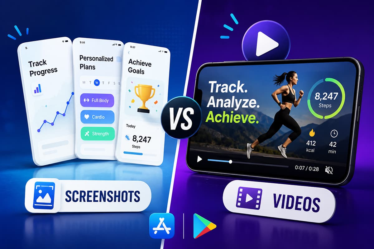
Videos and screenshots do different jobs. Use the right one for the right job and your listing converts harder.
Most app teams treat the App Preview video as "the screenshot, but moving". That is the wrong mental model. Screenshots are a poster. A preview video is a 30-second elevator pitch. The two work together, but they are not interchangeable — and on either store, the wrong choice in either slot can quietly cost you installs.
This guide breaks down when each one converts, the 2026 specs for both stores, and how to combine them so the listing reads as one coherent pitch.
What each format actually does
Treat them as two different surfaces with two different jobs:
| Screenshots | App Preview video |
|---|---|
| Scanned in under 2 seconds | Watched for 5–15 seconds on average |
| Communicate outcomes via headlines | Communicate flow and feel via motion |
| Indexed in search by both stores | Not indexed — pure conversion surface |
| Required (1 minimum, 5–8 ideal) | Optional, but auto-plays on the listing |
Screenshots win the search-results glance. Videos win the listing-page decision. You need both performing for the listing to convert at its ceiling.
When a preview video helps
Add an App Preview video when your app has one of these characteristics:
- The value is in the motion. A camera-based app, a drawing tool, a fitness tracker, a game — anything where seeing it move is more convincing than seeing a frozen frame.
- The flow takes explaining. If the app does something genuinely new and a still image can't convey the "aha", a 15-second walkthrough does the heavy lifting.
- The polish is the product. For premium apps where craft and feel are the differentiator, motion sells what static images can't.
- The audience is comparison-shopping. Users in saturated categories (productivity, fitness, photo editing) scrub through 3–5 apps before installing. A strong video wins that scrub.
When a preview video hurts
Skip the video — or postpone it — if any of these are true:
- The video is just static screenshots panned with Ken Burns. This reads as filler and lowers trust. If you can't show real motion, ship screenshots only.
- The app is straightforward enough that the screenshot already nails the pitch. A unit converter doesn't need a video.
- You don't have time to localize it. A polished English-only video in a non-English market is worse than no video at all — it signals "not made for you".
- The video would be visibly low-quality. A blurry screen recording with system UI in shot drags the whole listing down.
Apple App Preview — 2026 specs
Apple lets you upload up to three App Previews per device size. The first one auto-plays muted on the listing page in search and on the product page.
- Duration: 15 to 30 seconds
- Format: .mov, .m4v, or .mp4 (H.264 High Profile Level 4.0, or ProRes 422 HQ)
- Frame rate: Up to 30 fps, progressive
- Maximum file size: 500 MB
- iPhone 6.9" (iPhone Air, 16 Pro Max, 15 Pro Max): 886 × 1920 portrait (or 1920 × 886 landscape)
- iPad Pro 13" (M4/M5): 1200 × 1600 portrait (or 1600 × 1200 landscape)
- Audio: AAC stereo, 256 kbps, 44.1 or 48 kHz (most users watch muted)
- Poster frame: defaults to the 5-second mark — set it manually in App Store Connect for a stronger still
Apple is strict about content. The footage must be screen captures from the app — no hands or fingers on the device, no over-the-shoulder shots, no live-action of people using the phone. Voiceover is permitted but optional, since previews autoplay muted; captions do the heavier lift. Straightforward transitions like dissolves and fades are fine, but effects that imply functionality your app doesn't actually have are not. AR apps are the one exception to the "app footage only" rule — they can show real-world context for virtual objects, as long as the setting is uncluttered and free of personal information or third-party content.
Google Play promo video — 2026 specs
Google Play takes a single YouTube URL rather than an uploaded file. The video plays in the feature graphic slot on the listing.
- Source: a YouTube video URL — must be public or unlisted (private won't render). Direct uploads aren't supported.
- Duration: Google doesn't set a hard min or max, but only the first 30 seconds autoplay on the listing — front-load your value. Most teams ship somewhere between 30 seconds and 2 minutes.
- Aspect ratio: YouTube renders 16:9 by default. Portrait footage gets letterboxed unless you design the sides — plan for landscape if you can.
- Feature graphic required: the promo video only displays if you've also uploaded a feature graphic (1024 × 500). The graphic is the cover; users tap a play button overlaid on it.
- No ads, no age-restricted content. Either will block the video from showing. Disable monetization on the YouTube upload.
Google's rules are looser than Apple's — you can include marketing footage, voiceover, and people on screen. But the same principle applies: the more it looks like a real product demo and the less it looks like a TV ad, the better it converts.
The first three seconds decide everything
App Preview videos auto-play muted in the listing. If the first three seconds don't earn attention, the user scrolls past and the rest of the video may as well not exist.
What the first three seconds should do:
- Open inside the app, not on a logo card. Skip the splash screen. Skip the brand intro. Start in the UI, mid-action.
- Show the most visually distinctive moment first. The one frame that says "this is what this app is".
- Use one big on-screen caption. Since the user is watching muted, the caption carries the message. Same rules as screenshot headlines — under 7 words, outcome-focused.
Designing for muted playback
The vast majority of App Preview views are muted. Design for that:
- Captions on every spoken or implied line. Voiceover is decoration; captions carry the meaning.
- Visual rhythm over audio rhythm. Cut on visual beats, not on music or narration.
- No reliance on sound effects. Pings, swooshes, and notification sounds may as well not exist.
If your video only makes sense with sound on, it's a YouTube ad — not an App Preview. Re-cut.
How videos and screenshots fit together
The most effective listings treat the two as a sequence:
- Video — the elevator pitch, 15–30 seconds, "here is what this app feels like in motion".
- Screenshot 1 — the hook in still form, with the headline that converts.
- Screenshots 2–3 — proof and differentiator (see best practices).
- Screenshots 4–6 — features and trust.
Users who watch the video then scroll into the screenshots should see the same headlines, the same color palette, the same type rhythm. If the video uses one aesthetic and the screenshots use another, the listing reads as two different products glued together.
Localizing the video
Apple lets you upload separate App Preview videos per locale. Google Play accepts a different YouTube URL per locale. Localizing the video matters most for the on-screen captions — re-render those in the local language.
If you don't have the budget for fully localized videos, prioritize:
- Localized captions in the existing footage (re-render, don't subtitle)
- Localized app UI in the captured footage (record the screen with the app set to the target language)
- The first three seconds — if nothing else is localized, at least make the opening caption land in the user's language
Common preview video mistakes
- Starting on a logo or splash screen. Wasted seconds. Start in the UI.
- Cuts that are too fast. Under 1 second per shot reads as a flashy ad, not a product demo. Aim for 2–4 seconds per beat.
- Cursor or finger overlays. Apple disallows hands and devices on screen. Use motion graphics for the "tap" indicator.
- Music-driven edits with no captions. Most users watch muted; you're editing for an audience that isn't there.
- Showing more than three features. A 30-second video can land one main idea and two supporting beats. More is noise.
- Mismatched aesthetic vs the screenshots. The strip below the video should feel like the same brand.
The short answer
If your screenshots are strong, ship them first. Then add an App Preview video when (a) the value is genuinely in the motion, (b) you can localize it for your top markets, and (c) you can produce something that looks better than "pretty good". A weak video hurts the listing; a strong one is the highest-leverage piece of marketing your app has on the listing page.
Design store-ready screenshots in minutes — free, no watermarks.
Launch Shots is free forever. Every template, every device frame, AI localization to 100+ languages. No credit card needed.
Start creating free →Screenshots and videos aren't a competition. They're two parts of one pitch. Get them aligned and your listing stops leaking installs.