11 Common App Store Screenshot Mistakes (And How to Fix Them)
The most common mistakes in App Store and Play Store screenshots — from unreadable thumbnail text to missing localization. Each mistake comes with the fix.
If your install rate is lower than it should be, the screenshots are usually why. Here are the eleven mistakes we see most often.
App Store and Play Store screenshots are the highest-traffic, highest-leverage marketing surface most apps have. They also break in predictable ways. After reviewing thousands of listings, the same mistakes show up again and again.
Here is the working list, with the fix for each.
1. The first screenshot is decorative, not informative
What it looks like: A pretty hero image with the app icon and brand name and nothing else. No headline, no proof, no UI.
Why it fails: The first screenshot is the one that decides whether someone scrolls. A decorative image gives the user nothing to grab onto.
Fix: Replace it with a real screenshot of the app in use, with a one-sentence headline naming the outcome.
2. The headline is the feature name
What it looks like: "AI-powered tracking". "Smart calendar". "Cloud sync".
Why it fails: Users don't install features. They install outcomes.
Fix: Rewrite as the outcome. "Know exactly where your money went." "Never double-book yourself." "Your work, on every device."
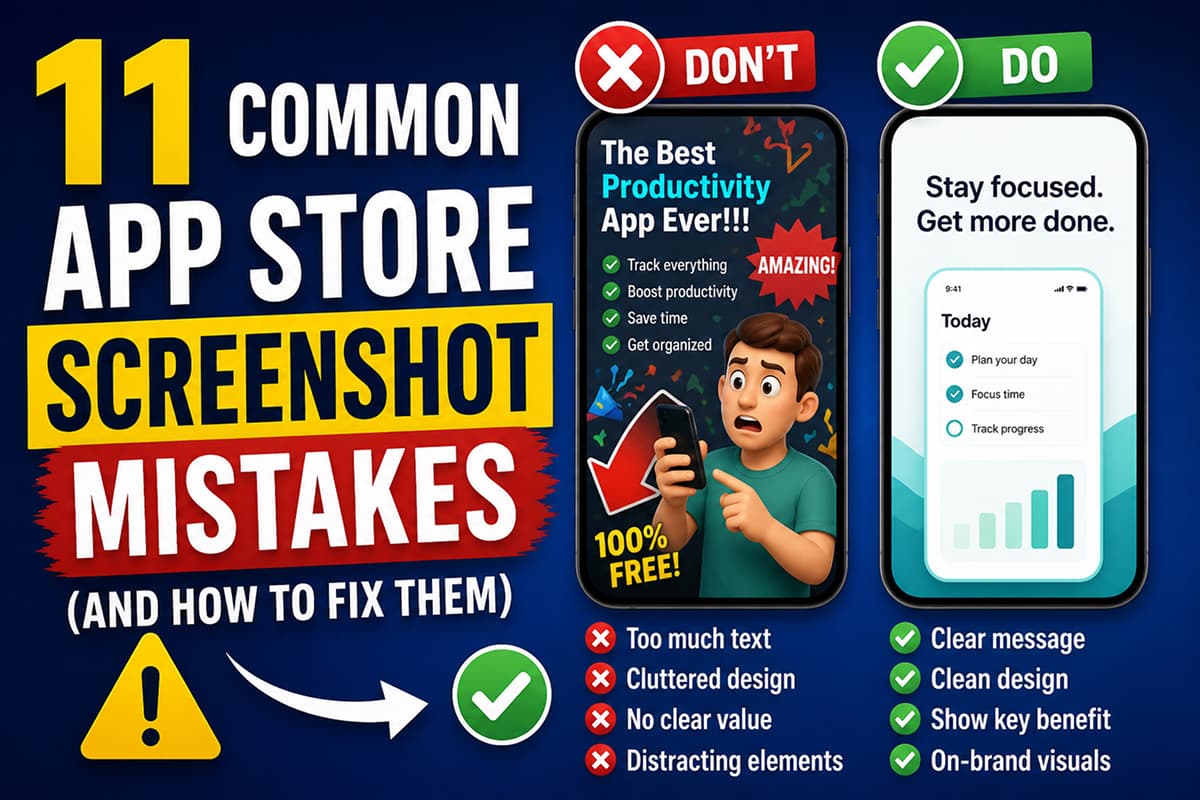
3. Text is unreadable at thumbnail size
What it looks like: Long, multi-line headlines in a small font over a busy photo background.
Why it fails: 80% of users see your screenshots first as small thumbnails in search results. If they can't read it at 200px wide, it doesn't exist.
Fix: Headlines under 7 words. Type at least 60–80px in your design canvas. Plain backgrounds or overlays behind text.
4. Three different fonts
What it looks like: One font for headlines, another for captions, a third inside the UI mockups, plus an emoji.
Why it fails: The eye registers chaos before it reads words. Multiple display fonts read as amateur.
Fix: One display font for headlines. One body font for captions and labels. That's it.
5. Inconsistent visual style across screens
What it looks like: Screenshot 1 is dark mode with a gradient. Screenshot 2 is white background with a tiny phone. Screenshot 3 is a photo. Each was designed in isolation.
Why it fails: The screenshot strip should read as one coherent piece. Inconsistency breaks the story.
Fix: Pick a single visual treatment (background, palette, type rhythm) and apply it across the whole set. Templates make this automatic.
6. The actual app UI is hidden
What it looks like: Big text takes up 80% of the screenshot, with a tiny phone in the corner showing nothing.
Why it fails: Users want to see what the app actually looks like. Hiding the UI is a red flag — they assume the app must be ugly.
Fix: The app UI should occupy at least half the screenshot. Headlines support the UI, not replace it.
7. No localization in non-English markets
What it looks like: The same English screenshots in every country.
Why it fails: Conversion in non-English markets is consistently lower for English-only listings. Apple and Google also rank localized listings higher in local search.
Fix: Localize at minimum the first three screenshots into your top three non-English markets. Tools with AI translation (Launch Shots ships with translation to 100+ languages, including RTL support for Arabic and Hebrew) reduce this from a multi-day project to about an hour.
8. Wrong export dimensions
What it looks like: Screenshots get rejected by App Store Connect or Google Play Console because they are the wrong size.
Why it fails: Apple requires very specific dimensions (1290 × 2796 for iPhone 6.9", 2064 × 2752 for iPad Pro 13"). Google Play has its own requirements (1080 × 1920 minimum for phone).
Fix: Use a tool that exports in the exact store-required dimensions. See the full screenshot sizes reference.
9. Same headline repeated
What it looks like: Five screenshots all saying variations of "Track your habits."
Why it fails: Each screenshot should advance the pitch. Repeating the same point wastes prime real estate.
Fix: Map each screenshot to a different beat: hook → proof → differentiator → feature 1 → feature 2 → trust.
10. Stock-photo lifestyle backgrounds
What it looks like: A phone floating over a coffee cup or a pair of hands typing. Generic.
Why it fails: Users have seen exactly that image on a thousand other apps. It signals "template" and reduces trust.
Fix: Use solid color or branded gradient backgrounds. If you want lifestyle imagery, shoot something custom or generate something specific to your app.
11. Watermarks on the free plan
What it looks like: A small "Made with [Tool Name]" tag at the corner of every screenshot.
Why it fails: Watermarks signal amateur. Apple and Google haven't banned them, but users notice.
Fix: Use a tool that doesn't add watermarks. Launch Shots is free with no watermarks — even on the free plan, every export is clean.
The minimum viable screenshot set
If you fix the eleven mistakes above, your screenshots will be in the top 20% of listings on either store. The minimum viable set:
- 5 to 8 screenshots, in the exact store-required dimensions
- First three tell a complete story (hook → proof → differentiator)
- Headlines under 7 words, outcome-focused
- Consistent visual style across all screens
- Real app UI visible in every screenshot
- Localized into at least your top three markets
- No watermark
Design store-ready screenshots in minutes — free, no watermarks.
Launch Shots is free forever. Every template, every device frame, AI localization to 100+ languages. No credit card needed.
Start creating free →Most listings are not bad because the design is wrong. They are bad because of small, fixable mistakes that compound. Fix the eleven and watch your install rate move.