App Store Screenshot Best Practices (2026)
What actually works in App Store and Play Store screenshots in 2026. Headline patterns that convert, the right number of screens, when to use device frames, and the mistakes to avoid.
A practical, no-fluff guide to screenshots that actually drive installs.
App Store and Play Store screenshots are the single highest-leverage piece of marketing your app has. They appear in search results before anyone reads your description. They are visible in the first second of a store listing. And they are the thing that decides whether a person taps install or scrolls past.
This guide collects what the evidence and operator experience consistently show actually works in 2026 — across both Apple App Store and Google Play. None of it is theoretical. It is the pattern that converts.
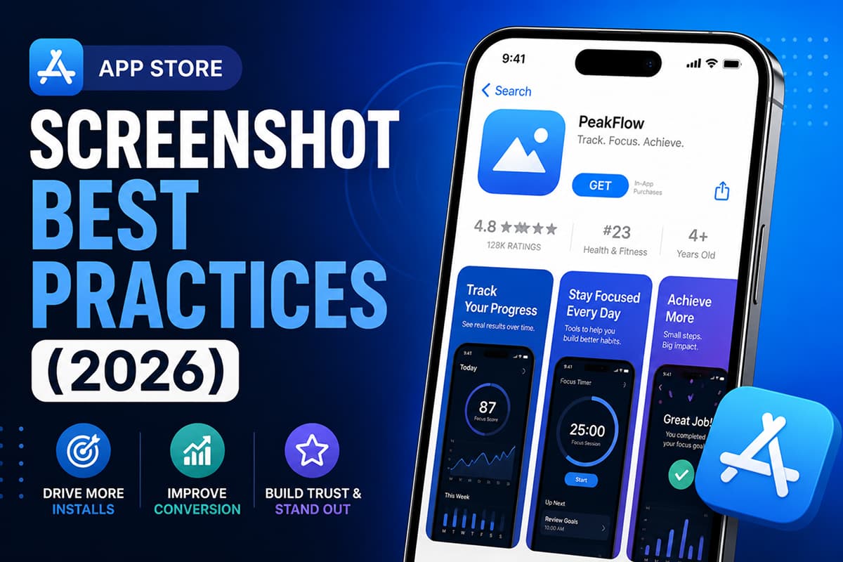
The first three screenshots are everything
On the App Store, only the first two or three screenshots are visible above the fold in search results and on the listing page. On Google Play, the first three are most visible in search and listing previews.
Treat the first three screenshots as a self-contained pitch:
- Screenshot 1 — the hook. One sentence that names the outcome the user gets. Not a feature. An outcome.
- Screenshot 2 — the proof. The most visually convincing demonstration of the app working.
- Screenshot 3 — the differentiator. What this app does that competing apps don't.
If a user only sees those three, they should still be able to answer: what does this app do, why is it better, and is it for me.
How many screenshots to include
Apple allows up to 10 screenshots per device size. Google Play allows up to 8. The optimal count is between 5 and 8 — enough to tell a complete story, few enough that users actually scroll through them.
A reliable structure for 6 screenshots:
- Hook — outcome headline + hero image
- Proof — best-looking real product UI
- Differentiator — what only this app does
- Feature one — most-used feature, named
- Feature two — second most-used feature
- Trust — reviews, awards, badges, or stats
Headline copy that converts
Most under-performing screenshots use the feature name as the headline. Strong screenshots use a sentence that describes what the user gets.
| Weak headline | Strong headline |
|---|---|
| "AI-powered tracking" | "Know exactly where your money went" |
| "Smart calendar" | "Never double-book yourself again" |
| "Fitness companion" | "Run your first 5K in 8 weeks" |
| "Chat assistant" | "Get an answer in 3 seconds, free" |
Rules for headlines:
- Keep them under 7 words. Shorter is better.
- Lead with a verb or an outcome, not a feature.
- Use plain English. No jargon, no "leverage", no "solution".
- Make every word earn its place. Cut adjectives.
Device frames: yes or no?
Device frames (the iPhone or Android phone outline around your screen) help users instantly understand they are looking at a mobile app and not a website mockup. They orient the eye.
Use device frames for screenshots that:
- Show a single feature in detail
- Need to read as "a real app, on a real phone"
- Are part of an iOS or Android-specific story
Skip device frames for screenshots that:
- Use the screenshot as a background canvas for a big headline
- Show a partial UI element (a card, a notification) close-up
- Are pure marketing visuals, not product proof
Vertical vs horizontal screenshots
Portrait (vertical) screenshots are the default and work in 95% of cases. Landscape (horizontal) screenshots make sense only when:
- The app itself is landscape-only (games, video editors)
- You need to show a wide UI (dashboards, timelines)
- You are filling a panoramic hero in the listing
If you are unsure, ship portrait. Apple and Google index portrait screenshots more aggressively in search.
Color, contrast, and readability
Screenshots are viewed at thumbnail size in search results. The rules of thumbnail-readable design apply:
- High contrast between text and background. If you squint and can't read the headline, neither can the user scrolling at speed.
- Large type. Headlines should be readable at 200px wide.
- Limit your palette. Two or three colors total — your brand color, a neutral, and an accent.
- Avoid full-bleed photo backgrounds behind text. Add an overlay or panel.
Localization
Apps localized into the local language consistently see higher install rates in non-English markets. The big wins are:
- Spanish (LATAM + Spain) — large user base, high lift
- Portuguese (Brazil) — disproportionately high engagement
- German, French, Japanese — premium markets
- Hindi, Arabic, Indonesian — fast-growing markets
You don't need to localize every screenshot — start with the first three (the most visible ones) per language. Tools that include AI localization (such as Launch Shots, which ships with translation to 100+ languages) make this a few-minute job rather than a multi-day translation project.
What to A/B test
Both App Store Connect (Product Page Optimization) and Google Play (Store Listing Experiments) support A/B testing. Test in this order, one variable at a time:
- Screenshot 1 headline. Highest leverage variable.
- Screenshot 1 visual. Hero image style and color.
- Screenshot order. Try moving your strongest screenshot to position 1.
- Device frame on/off. Sometimes the bare screen out-converts the framed one.
Run each test for at least 7 days and to statistical significance before drawing conclusions.
Required dimensions
Apple App Store screenshots in 2026 require:
- iPhone 6.9" (iPhone 16 Pro Max, 15 Pro Max): 1290 × 2796 px portrait
- iPad Pro 13" (M4): 2064 × 2752 px portrait
Google Play screenshots require:
- Phone: 1080 × 1920 px minimum (9:16 ratio)
- Feature graphic: 1024 × 500 px
- App icon: 512 × 512 px
Other sizes are optional. For the full reference, see the screenshot sizes guide.
Common mistakes to avoid
- Generic stock-photo backgrounds. Users have seen them a thousand times.
- Tiny text. If it's not readable at thumbnail size, it doesn't exist.
- Three different fonts. Pick one display font and one body font. Stop.
- Feature lists without context. "Track. Plan. Win." means nothing without an outcome.
- Hiding the actual UI. If the screenshot doesn't show what the app does, it's not a screenshot, it's a poster.
- Same headline twice. Each screenshot should advance the pitch.
Quick checklist before you ship
- First three screenshots tell a complete story
- Headlines are under 7 words and lead with outcomes
- Text is readable at thumbnail size
- Brand colors are consistent across all screens
- No typos in any language
- Localized for at least your top three markets
- Exported in the exact required dimensions
Design store-ready screenshots in minutes — free, no watermarks.
Launch Shots is free forever. Every template, every device frame, AI localization to 100+ languages. No credit card needed.
Start creating free →Good screenshots are not about decoration. They are about being clear, fast, and honest about what your app does and why someone should install it. Get those three right and most of the design choices fall into place.